I’m going to have the word “values” tattoo’d on my arm somewhere. Or maybe my forehead, so that every time I look in the mirror, I’m reminded again about the most important thing in my paintings. values. Values. VALUES. Sometimes, I’m so tired of struggling with them, I really do want to yank my hair out. But every time I’m struggling to make a painting “work” that’s usually the culprit. I can still hear Pam Padgett standing back from a painting in a workshop I took years ago and gleefully shouting, “It’s reading!!”, which meant, the values were right.
I don’t know any artist out there who doesn’t either occasionally struggle with values, or always does. Either way, getting values is primary. If you’re a new artist and don’t feel like your paintings are “reading”, then check your values. There are several value “systems”, some artists use 4, some use 5. I usually stick with 4. It’s a good number. 🙂 Here’s a simple diagram I did for an artist friend to try to explain values.
I suggested that he take a single color and practice values without trying to make a finished painting. This example works no matter what color you use. That’s how artists can pull off paintings that have zero to do with “color matching” to the actual subject.
And a “key”:
- Uprights are always darkest
- Slants are 2nd darkest
- Ground is 3rd
- Sky is lightest
The last few paintings I’ve done, I have really stayed focused on the values. Most of the scenes I’m working on actually portray values correctly, whether I’m working in plein air or in my studio working from photographs, It’s the battle my eyes have with brain when it comes to actually mixing the color that causes me to make errors in assessing and interpreting values.
The problem is not really “there”, it’s something my brain creates. I recall a terrific drawing instructor I had at Watkins College of Art & Design, Johnny Park, telling us time and time again, “Draw what you see, NOT what your brain tells you to draw!!” My brain is often working over-time, over-thinking, over-analyzing. Just stop it already!!
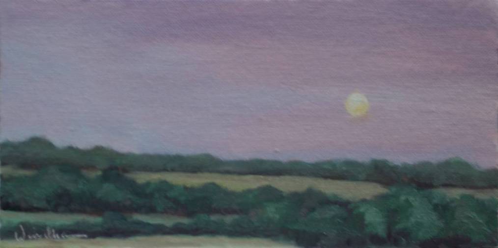
“Low Moon”, 5×10 came from not over-thinking and keeping it simple. I saved the difficulty for the next painting. You’ll see it, as soon as I figure out how to mix a “real” purple.


